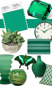
Interior Design Colour Trends in 2013
 by Jan Addams CDECA™, LIIID, MIRM
Style and Design go hand in hand when it comes to colour.
In fact you will often see a colour progression from warm to cool colours flowing back and forth in intensity from one year to the next. Pantone has been the leader when selecting a ‘yearly’ colour.
Colour is one of the most powerful elements in Interior Design. Colour is a mood creator that can inspire or depress, heal or cause anxiety. Colour can evoke memories that take occupants back to a time of pleasure or pain.
When you use colour with this knowledge you become more aware of how selecting the ‘right‘ colour for your own wardrobe and / or your home or office becomes as important as the food you eat and the air you breathe.
Colour is life, colour is health, colour is youth and colour demands respect. So, when you come to choosing a colour for your room find inspiration from a favourite piece of art (painting, photo), fabric (cushions, drapery or area rug) or glass or stone (counters, tile, flooring) and build on the theme adding each element like layering a cake which will lead you to the ‘final‘ selection your paint colour. (See Benjamin Moore for inspiration)
Pantone’s 2013 Colour of the Year is Emerald. That just happens to be my favourite colour! In fact I think I need to find some toss cushions that will harmonize with my burgundy leather sofa to brighten my living room and calm my overly busy mind.
Click here to read more about how Color Harmonics influences your wardrobe, interior design and even your industry or business brand. This is the Power of Colour!
What is your favourite colour?