COLOR Harmony is KEY to Creating a…
Pleasing Personal IMAGE, a Comfortable INTERIOR Space or, a Memorable INDUSTRY- Brand
Hi ’DAT Girl’ here,
 I would like to talk about one of my Great Passions – Colour.
I love how when people wear the ‘right’ colours their eyes sparkle and they look 10 years younger!
I love how by intentionally picking a piece of colourful, style oriented artwork a focal point is created for introducing mood enhancing ‘Colour’ or ‘Color’ in an Interior Space.
I love how ‘Colour‘ is as memorable as music, sounds and smells. I truly believe that without colour this world would be a dark, cold and a lonely place.
Don’t get me wrong – I love my Black, White, Browns and Greys but, only when they act as the neutral backdrop for magnificent primaries and blends from our colourful spectrum!
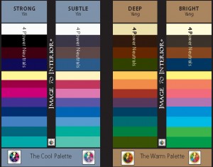
Below is a Basic Colour Tool that I Created showing 4 colour harmonies. ;;
 On the COOL SIDE: STRONG & Vivid Blue Under-toned Colours next to the SUBTLE Blended or Dusted Blue Under-toned Palette
On the WARM SIDE: DEEP Golden Saturated Colours to the BRIGHT & Clear Yellow Under-toned Colours
This Theory is based on how Colours appear under ‘Natural light’: even in natural daylight, there are differences seen in colour.
Picture the Yin/Yang Symbol – The Yang Side is Dominant light the Sun (Warm – Daylight) and the Yin Side is Receding like the Moon (Cool – Evening)
- A sunny day showcases warm Clear & BRIGHT Yellow infused Colours.
- By evening, the colours that surround us have a DEEP Golden saturation from the warm end of the spectrum.
- As twilight descends, all colours Cool down and appear more SUBTLE with a Dusted Blue tone to them ;;
- At midnight, by the light of a full Cool Moon, Colours have a STRONG Blue undertone and are at their highest contrast
I patented a full scale Colour Tool called ‘Color Harmonics ®‘ with 110 colour harmonies to help people decide which colours to wear, use in their home and for their business marketing materials. It is now available inside the Soft Cover Style Journal – Discovering Your Inner Style book as well as in full colour in the Online version.
Chapter 2:
;;
Excerpts from Discovering Your Inner Style – 8 Steps to G U R U
è
Where does colour come from?
For centuries, colours were thought to be part of the object viewed. Sir Isaac Newton discovered that colour was contained in light itself, not in the object as formerly thought.
 The origin of colour is light. Without light, we would not be able to distinguish the differences between colours. Light travels in waves. The wave is a characteristic movement of all types of energy. Light is a small portion of the electromagnetic spectrum, which also includes X-rays, ultraviolet and infra-red light, microwaves and radio waves. Each colour of the spectrum moves to a different wavelength.
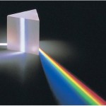
A white beam of light shot through a prism registers all the colours of the electromagnetic spectrum from red to violet.
Of the tiny portion of what we see as visible light, Red is the longest wavelength – closest to black light (absorption of all colours) and Violet being the shortest wavelength – closest to white light (reflection of all colours). All other colours fall somewhere in between.
These pure colours are often referred to as “rays” by Colour Therapists.
The sun is our local source of almost all of the electromagnetic spectrum both long and short waves. Our atmosphere screens out most of the harmful rays. But when we damage our atmosphere by pollution, we will ultimately hurt ourselves.
COLOUR Illusions and Effects:
Afterimage: This image is related to simultaneous contrast. Simply stated, if you stare at one colour long enough and close your eyes, you’ll see its complementary colour; eg., red creates a green afterimage.
Light on texture and finishes: Basically the same colour can be applied to several surfaces, and all appear different due to the inherent distinctions of the surface used.
Metamerism: Using a colorimeter will show that some colours don’t have the same reflectance curve. They can appear to match under certain lights, but not under others.
Simultaneous contrast: This colour phenomenon was discovered by Michael Eugene Chevreul. He discovered that each hue projects its complement on the adjacent hue. Therefore, to receive the maximum intensity of a hue, surround it with its complement!
Value Relationships: Degree of the lightness or darkness of a colour is affected by the adjacent colour values. Strong contrasts cause light areas to appear lighter and dark areas to appear darker.
Natural light: even in natural daylight, there are differences seen in colour.
*Too little, or the wrong lighting, can destroy a room at the flick of a switch! Incandescent light emphasizes the yellow and red colours, but dulls the blue and violet colours. In contrast, regular fluorescent lighting emphasizes the blues and greens, while dulling the reds.
